The central point of JTBD is that innovators over index on what they can build and under index on progress the customers wants. Too often innovators ‘scratch their own itch.’
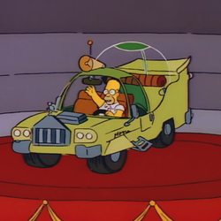
This doesn’t mean verbatim bequeaths . Do that, said Ford CEO Jim Farley, and you get The Homer.
No, successful JTBD innovation uses the customer’s language.
One mistake, writes Frank Lutz in his book Words that Work: It’s Not What You Say, It’s What People Hear, is explaining in actions rather than outcomes. Actions are what I can build whereas outcomes are the progress.
A business that offers same day responses resonates more with customers than one that has “agents standing by”. How a customer describes their issue outlines the progress a customer wants to make.
An example of customer language comes from GEICO’s advertising start. GEICO executives told their marketers that, on average, phone calls took eight minutes and customers saved about 18%. Good numbers.
But when the marketing staff listened to the customer language they found the numbers were too good. “Research pointed out,” said Ted Ward on NPR, “that ten minutes wasn’t long enough to talk about something like car insurance but fifteen minutes was, and twenty minutes was considered way too long.” Eighteen percent was too good too, hence the 15 minutes to save 15% or more.
Customer words are the breadcrumbs along the JTBD path. Innovators settle into metrics which may not be helpful but are familiar, easy to collect, and seem important. But those metrics aren’t how the customer sees the world. For instance:
- Best Buy Geek Squad formerly shared the average wait time. That led to disappointed customers. They switched to 90th percentile waits and customers became a lot happier.
- Netflix used to offer star ratings (3.2, 4.1, etc.). That didn’t resonate like sub-genres like my favorite, ‘one last job then I’m out’.
- Temperature can be Celsius or Fahrenheit but each has different fidelity. Laymen like Fahrenheit whereas scientists subscribe to Celsius.
- Canada gets avalanche descriptions. Americans describe a class three avalanche as medium ‘relative to the path’, whereas in Canada a class three ‘could bury a car, destroy a small building, or break trees.’
- This same effect exists at Disney. Touring Plans creator Len Testa noted that if his app says a time that’s too far from the Disney estimate people won’t believe it.
Each of these is an example of Lutz’s subtitle: it’s not what you say it’s what people hear. When people heard 8 minutes they knew it wasn’t enough time to get a legitimate car insurance quote.
…
Don’t miss any of the Job to be Done posts.